You are about to erase your work on this activity. Are you sure you want to do this?
Updated Version Available
There is an updated version of this activity. If you update to the most recent version of this activity, then your current progress on this activity will be erased. Regardless, your record of completion will remain. How would you like to proceed?
Mathematical Expression Editor
communication
We can easily define a function via a graph. However, it is not so easy to decipher
exact information from a graph, especially when the curve is drawn by hand.
Therefore, in addition to the points on the curve, we include other symbols to help
people read the graph and understand the function. These are communication
symbols. They help the reader understand what is drawn and what is not drawn.
This is the beginning of our attention to rigor.
Rigor
\(\blacktriangleright \)What is Rigor in a Mathematics Classroom?
Rigor is when students use mathematical language to communicate
effectively and to describe their reasoning with clarity and precision.
Students make understood “How do we know we have accounted for
everything?”
Rigor is one of the main threads in this course along with function structure. It will
take a lot of communication back and forth to learn how to present rigorous
explanations.
We have already commented that graphs are inherently inaccurate, so they might
seem an odd place to introduce rigor. On the other hand, we have noted that graphs
are communcation tools. This makes them an easy entrance to the ideas of
rigor. We can begin by using auxillary graph symbols to clarify our graphical
communication. Their presence and absence communicate information about the
function.
Endpoints
Points are dimensionless objects. They are too small to actually see. When we
draw a graph, the thickness of the pencil or pen is already an exaggeration
of the underlying points and makes the endpoints a mystery. How would
you tell if the very last point of a curve was included or not? Therefore, we
exaggerate even more for the endpoints, so that the reader immediately
understands whether or not they are plotted and included with the graph or
not.
We use big solid dots (blobs, discs) to illustrate an endpoint is a part of the
drawing. We use big hollow dots (circles) when the actual last point is not
included.
In the graph on the left, it is difficult to tell if the endpoints are included or not. The
graph on the right makes this clear.
The big exaggerated dots are just for the single endpoints. The curve on the
right does not actually include a circle as part of the curve. That circle is an
exaggerated single hollow dot indicating that the point \((4, 1)\) is not part of the
curve.
Arrows
When we use graphs to define functions, we need to communicate the domain. This is
difficult when the domain is large, such as \((-\infty , \infty )\). The paper we draw on is only inches
wide. So, we include several additional graph symbols to help the reader understand
what is happening out of view.
Arrows at the ends of curves signal that the curve continues its current pattern.
In the graph on the left, it is difficult to decide if the domain is the interval \((-3, 4)\) or not.
The graph on the right makes this clear.
Here, the arrow tells the reader that the curve continues its current linear pattern
indefinitely to the right. The domain is \([-3, \infty )\).
Asymptotes
Arrows at the ends of curves signal that the curve continues with its current pattern.
However, this may not not be enough. Many functions have curves that
continue moving down and to the right, however, their movement has a
boundary. We use dashed lines to indicate that a curve is approaching this line
pattern.
The arrows tell the reader that the curve continues its current pattern, for example
the right piece of the curve continues to move up and to the left. The dashed vertical
asymptote tells us that the leftward movement does not go past the line \(x=3\). The curve
continues to go up indefinitely while getting closer and closer to the asymptote,
without hitting the asymptote.
This tells us that the function becomes unbounded as you get closer to \(3\) in the
domain.
Horizontal asymptotes give similar information. The function graphed below gets
closer to the value of \(2\) as the values of the domain get bigger. Unlike with vertical
asymptotes, the graph of a function can oscillate back-and-forth across a horizontal
asymptote.
The values of the function, \(f(x)\), get closer to (or approach) \(2\) as we move through the
domain, heading to infinity (the right tail of the domain).
And, of course, we have algebraic notation to communicate this thought.
\[ \lim _{x \to \infty } f(x) = 2 \]
This “limit notation” is our algebraic way of communicating that the function \(f(x)\)
approaches the value \(2\) as the domain values become unbounded positively. More on
limit notation later in the course.
Ellipsis
Sometimes an arrow at the end of the curve may give the wrong impression.
Just an arrow may be
interpretted as the line continuing down.
If the pattern involves some kind of repeated (periodic) shape, then ellipses may be
used.
A graph is a communication tool. We already know that the accuracy of graphs has
limitations. There are also other limitations that we must deal with. To
that end, a nice graph displays other symbols besides just the points. These
other graphical features help the reader understand the thoughts of the
drawer.
Rigor
These graphical enhancements are not optional. They are a requirement of our desire
to be rigorous.
We know the author of the graph knows that these symbols are not optional. So,
when the symbols are missing, then we know that was intentional. The missing
symbol communicates information about the function.
Reading Graphs
The graph above has points with \(y\)-coordinates greater than \(5,000\).
True False
The graph above has points with \(y\)-coordinates less than \(-5,000\).
True False
The graph above has points with \(x\)-coordinates greater than \(5,000\).
True False
The graph above has points with \(x\)-coordinates less than \(-5,000\).
True False
Missing Symbols
All of these graphical symbols help the reader understand the graph. When the
symbols are not drawn, then we know the author of the graph does not want us to
interpret the graph in that way.
If there is no horizontal asymptote, then we should not read that the graph
is leveling off and becoming horizontal.
If there are no ellipses, then we should not assume the pattern repeats.
If there is no arrow, then we should not assume the pattern continues.
If there are no solid or hollow endpoints, then we need to question the
drawer.
The auxillary pieces drawn on a graph give us information and their absence gives us
information as well.
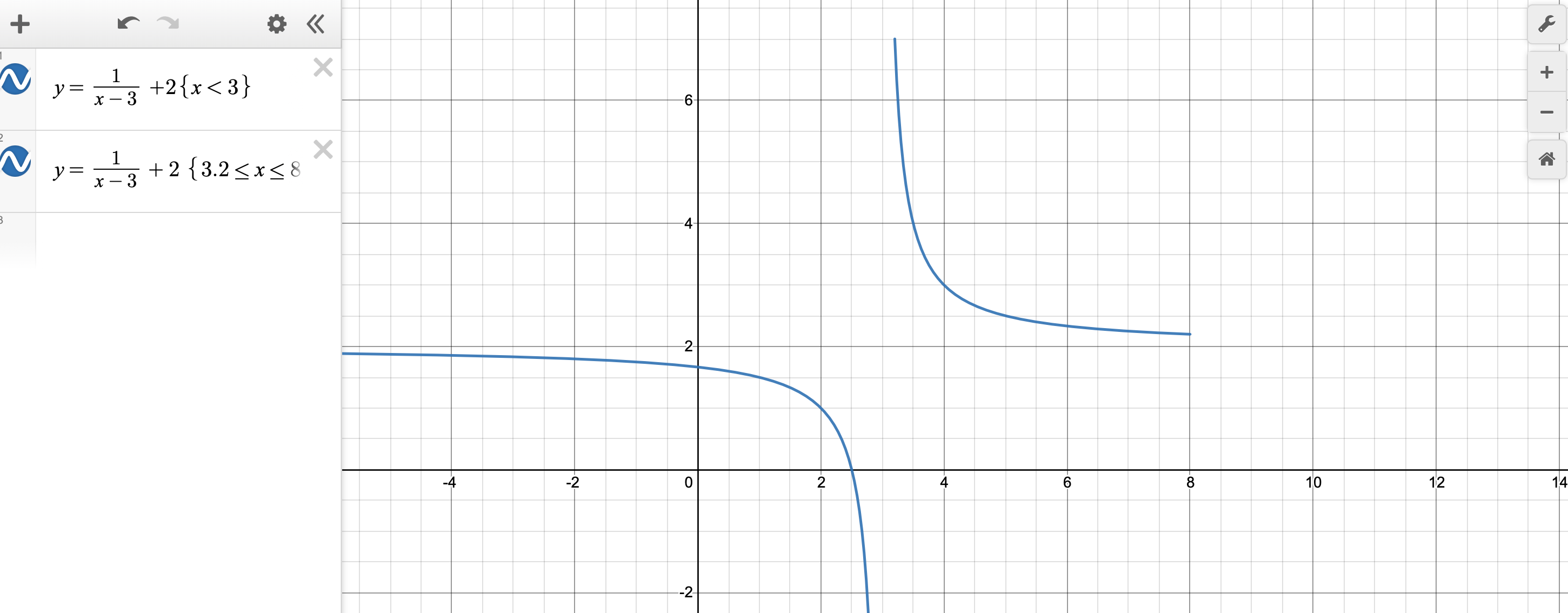
Technology
We are humans communicating to other humans, which is why we take care
to create readable and informative graphs. Technology does not have this
desire.
When working with technology, we have to accept that it is a machine giving us what
it is programmed to give. We must interpret correctly.
When we make our own graphs, then we can hold ourselves to a higher standard.
![[Picture]](graphicalCommunication-1039da28aaebf96c4d3980581f11f305.svg)
![[Picture]](graphicalCommunication-d965dff54f88c098c12881fee660b5bb.svg)
![[Picture]](graphicalCommunication-216be879a7b5e6a641e00b0cffe00179.svg)
![[Picture]](graphicalCommunication-60a7763cb4b8331f74c2e728aed51dc1.svg)
![[Picture]](graphicalCommunication-034ec33e7c62a91ed026b40f044b05dc.svg)
![[Picture]](graphicalCommunication-705f6533f6dce738bf505583a0305f6c.svg)
![[Picture]](graphicalCommunication-ae05ffd46b9be8bedba25532fce57ae4.svg)